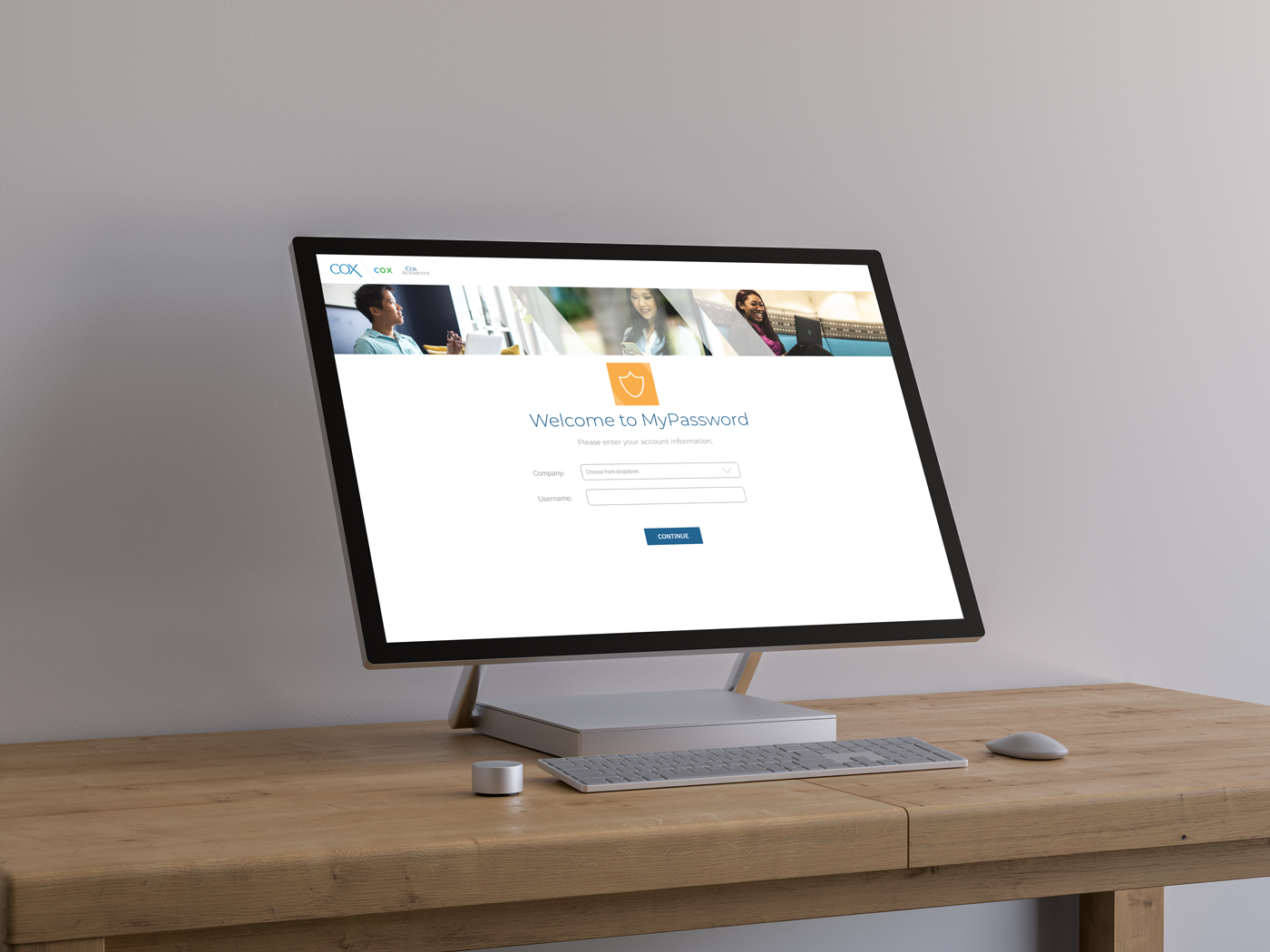
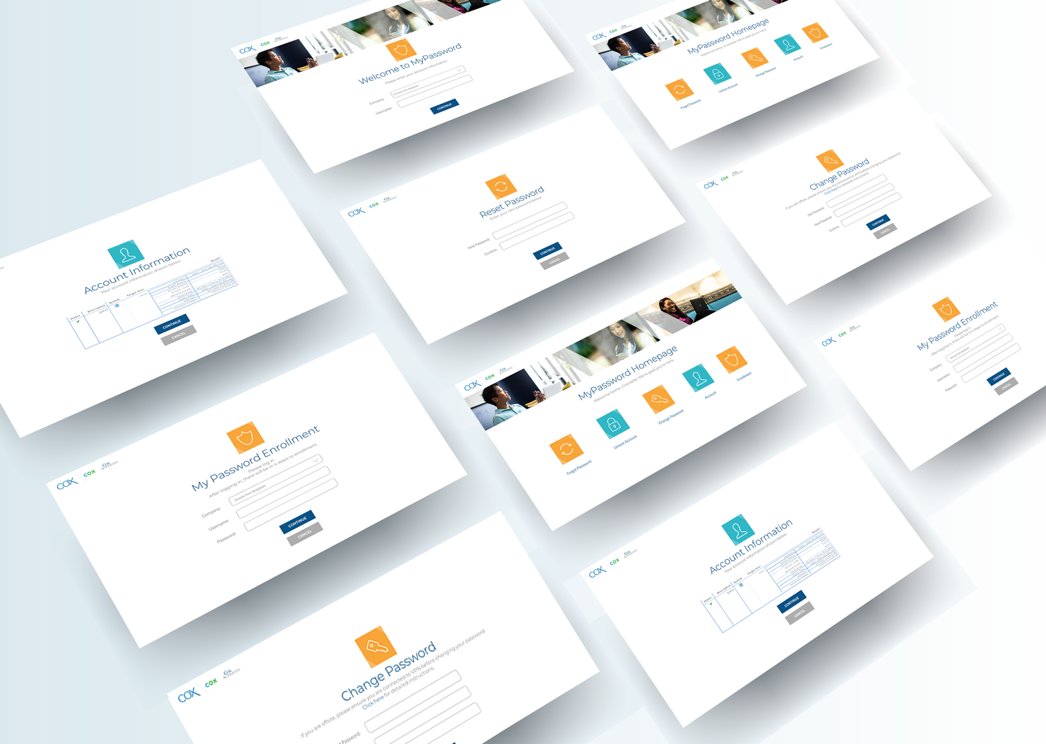
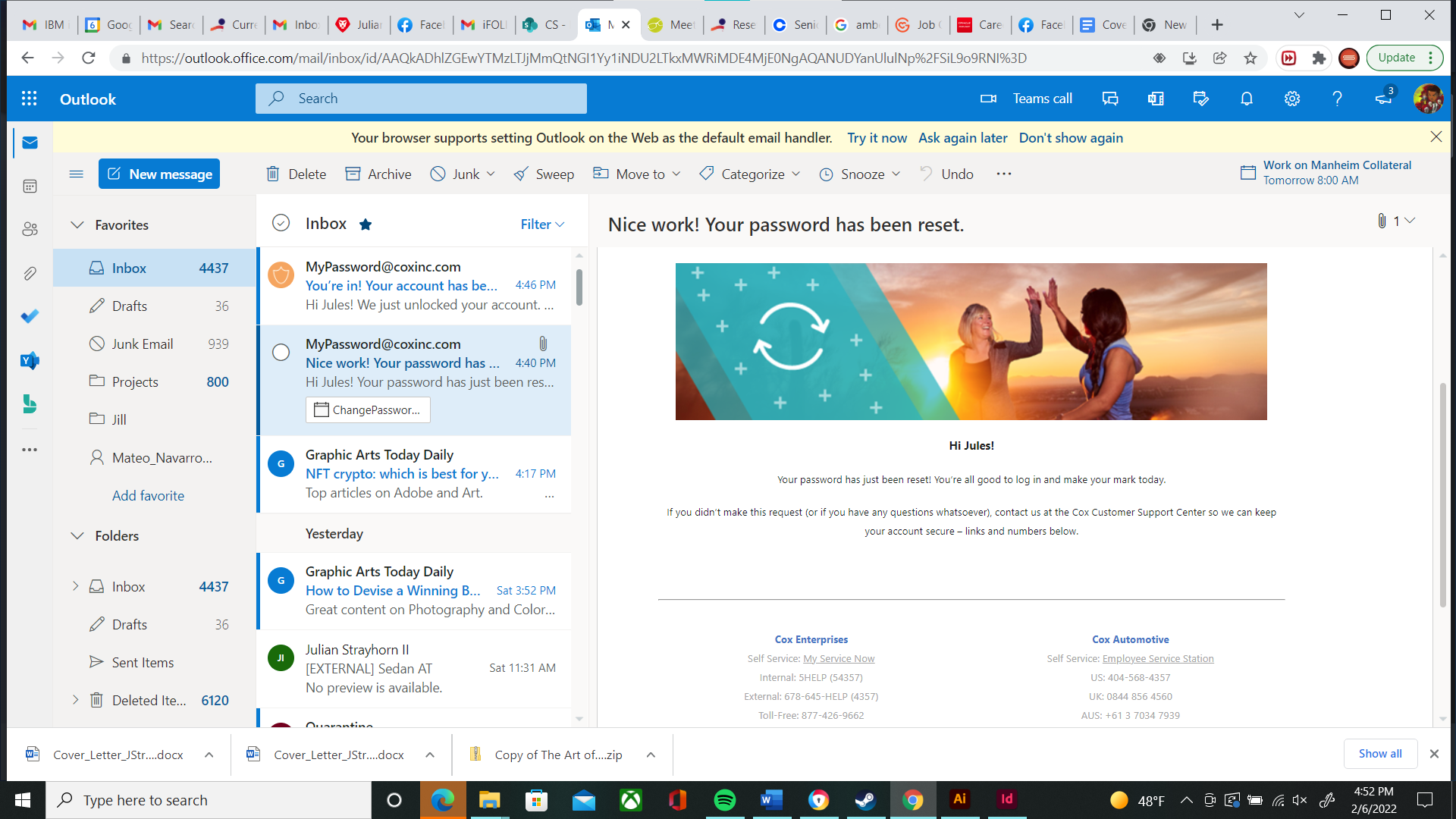
Make it an experience for others

Our employee password recovery site lacked human-centric design, leading to an inconsistent user interface (UI), a fractured information architecture and poor navigation features. Although it was already built and laid out our BMC Vice President approached myself and my Creative Director to reimagine the platform and roll out the revamped portal to be more employee focused.

Computer monitor on a wooden desk displaying a login page for 'MyPassword' with a company logo, fields for company selection and username, and a 'continue' button, with a wireless keyboard and mouse in front.
A collage of multiple screenshots of a website or web application for managing passwords called 'MyPassword'. The screens show login, account information, change password, reset password, and enrollment pages with icons and text fields. The design uses white, blue, and orange colors.
An Outlook email inbox with a message indicating that the password has been reset. The email shows a colorful illustration of two women high-fiving at sunset, with text confirming the password reset and guidance for unrecognized requests.