Children’s MyChart app
Role: Lead Designer
Year: 2024
Description
Navigating healthcare can feel intimidating—especially for parents managing their child’s care. Children’s Healthcare of Atlanta wanted to make that journey smoother by redesigning their MyChart app into a space that felt friendly, clear, and trustworthy. The goal was simple but vital: put essential tools—appointments, records, and messaging—right at families’ fingertips while reflecting the warmth and reliability of the CHOA brand.
Problem
Parents and caregivers often struggled to find the information they needed quickly. The existing MyChart interface felt too clinical and detached from the hospital’s playful, comforting brand identity. For a children’s hospital that values compassion and approachability, the app needed to do more than function—it needed to feel safe, simple, and human.
The challenge was to redesign the digital experience so it could guide families through healthcare moments with ease and reassurance, without sacrificing usability or credibility.
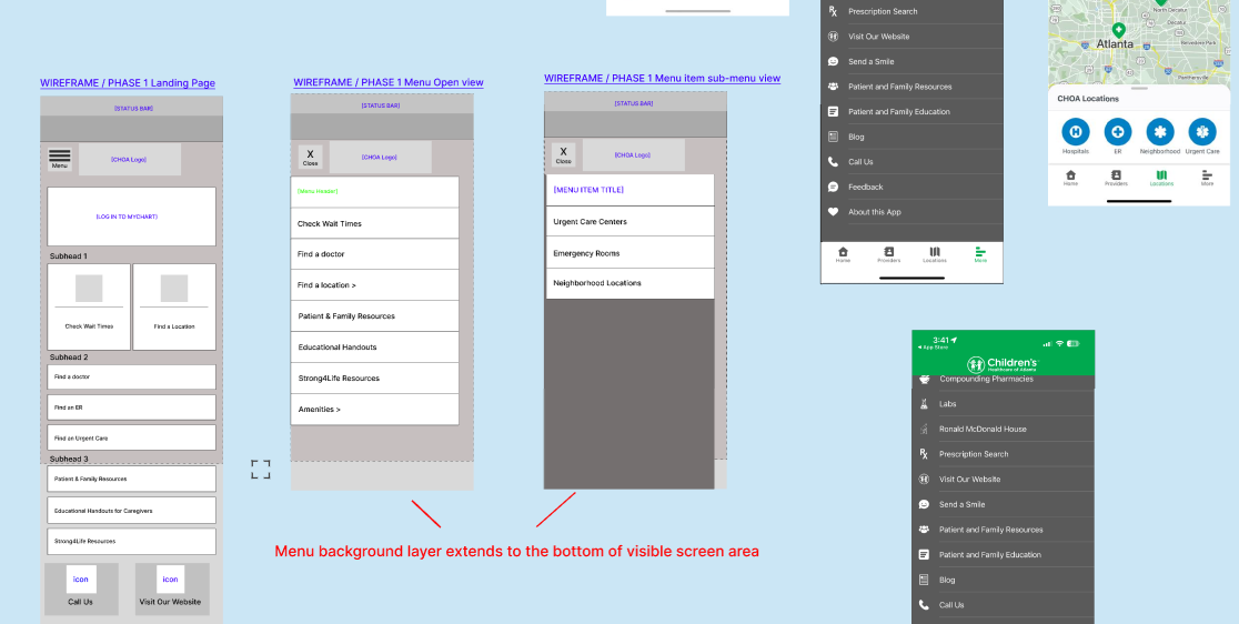
As the high-fidelity designer, I was responsible for translating early wireframes into polished, brand-aligned visuals. My focus was on balancing approachability and professionalism—a tone that felt inviting to parents but credible within a medical context.
I explored several icon systems and color palettes, testing how small design cues—rounded shapes, soft edges, or muted blues and greens—could convey both care and confidence. Collaborating with the UX and brand teams, I refined layouts, typography, and interaction patterns until every screen echoed the CHOA brand voice: comforting, clear, and compassionate.
One turning point came during icon selection. Initial concepts leaned too playful, risking loss of trust. By introducing a simplified, geometric icon set with subtle warmth, we achieved the right emotional balance—family-friendly yet dependable.

Impact
The redesigned MyChart experience created a more welcoming digital front door for caregivers and patients. The new visual system not only improved navigation but also strengthened CHOA’s brand consistency across digital touchpoints.
Parents described the app as “easy to understand and less intimidating,” while the client praised its alignment with CHOA’s mission to make healthcare more approachable for families.
This project reinforced the power of empathy-driven design—how the right visual tone can transform an everyday tool into something that comforts and connects.

